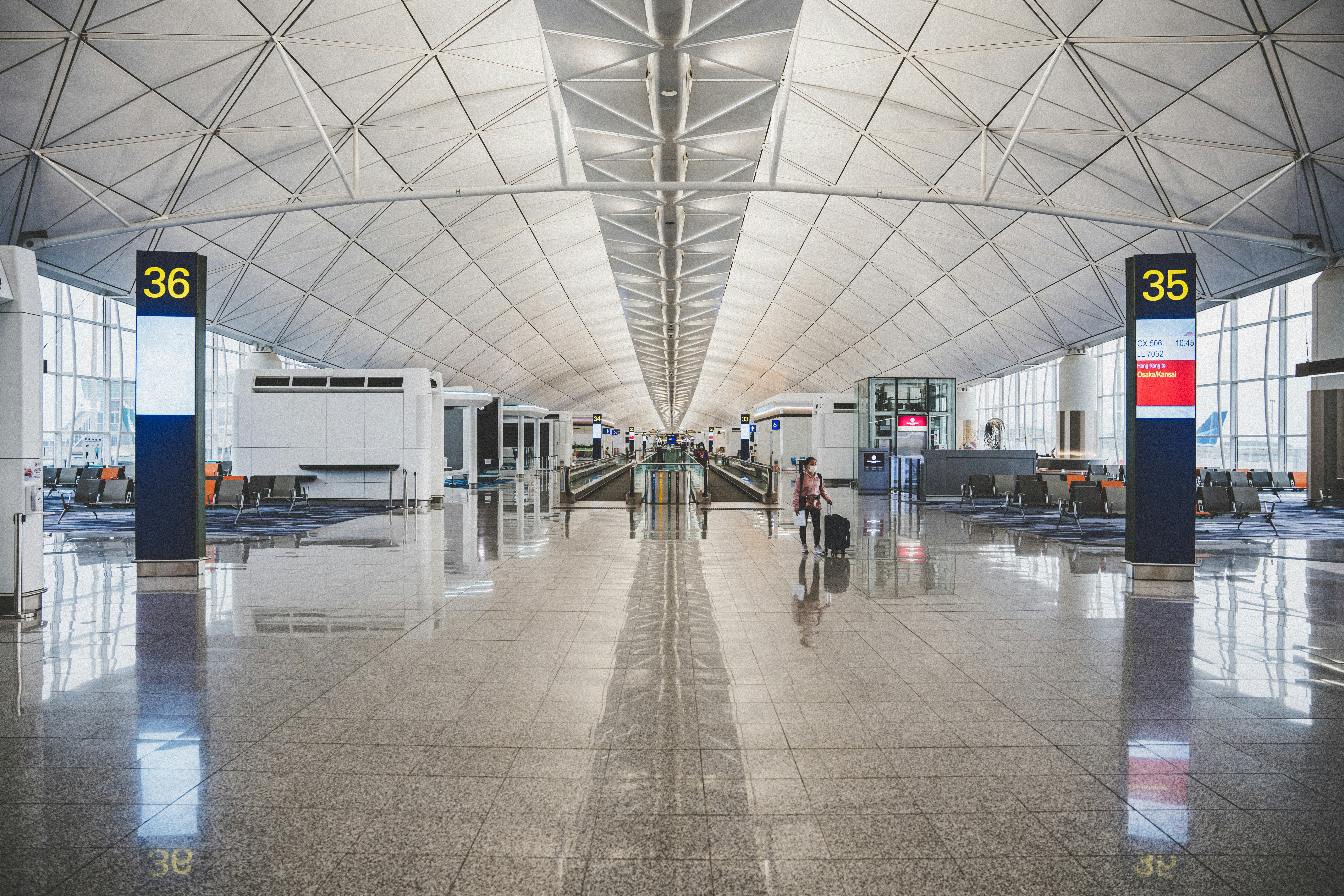
A sign is read once, at distance, by someone who is already moving and probably late. Every decision after that is secondary.
Studios present signage as artwork: a flat elevation, centred on a slide, viewed at arm's length on a good monitor. Nobody reads a sign that way. The rider reads it at nine metres, off-axis, in the two seconds between the escalator and the platform edge.
Test at distance, not on screen
Print the sign at full size and put it at the end of a corridor. Walk toward it. The size that survives that walk is the size, and it is almost always larger than the one that looked balanced in the layout.
On the transit rebrand we did this before any type was chosen. Two of the three candidate typefaces failed at nine metres because their counters closed up. That is a measurement, not an opinion, and it ended the discussion in an afternoon.
If it fails at nine metres, it is not a style question.
One arrow, drawn once
Arrow styles multiply because each sign gets designed on its own. Draw one arrow, define its eight rotations, and forbid the rest. A rider who learns the arrow on the concourse should not have to relearn it on the platform.
The same applies to contrast. Set a floor, write it into the specification as a number, and let the fabricator check it without calling you.
Write it as a decision tree
Guidelines that describe a sign are useless at three in the morning when a panel has been damaged. Guidelines that ask which size, which arrow, which colour, and give one answer each, get followed.
The test is whether a fabricator can produce a correct sign without a designer in the room. If not, the system is a mood board with dimensions.